University of York
Turning a complicated support offer into a single interactive tool for researchers to easily access in one place.
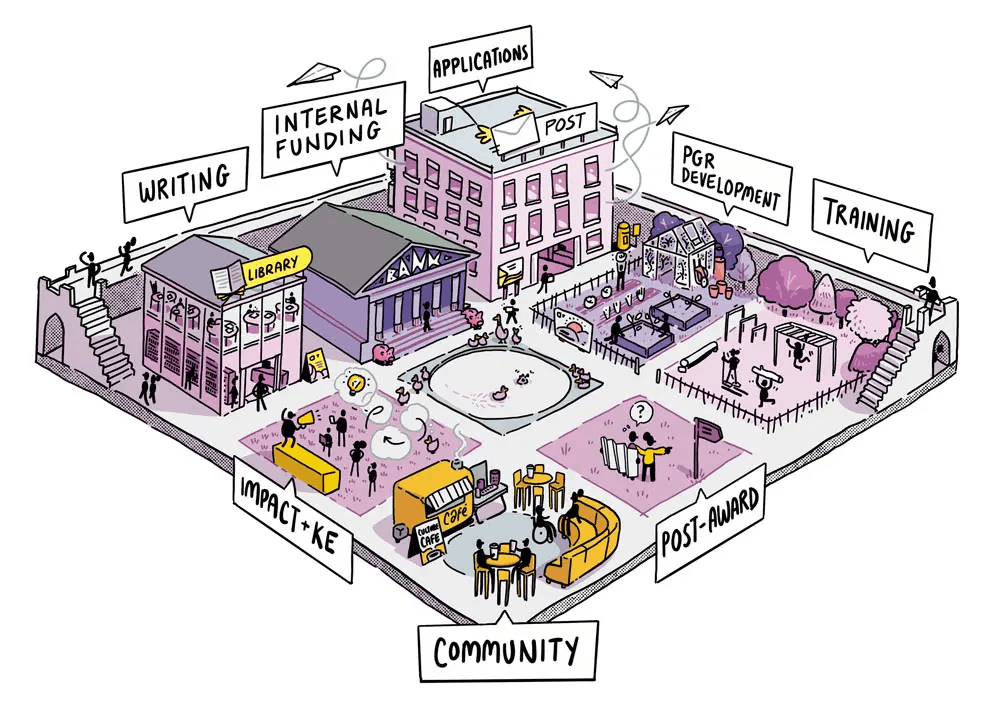
Info Fox | Interactive Navigation Tool

Turning a complicated support offer into a single interactive tool for researchers to easily access in one place.
Info Fox | Interactive Navigation Tool
Challenge:
Researchers at every career stage couldn’t find or navigate the support services available to them
Solution:
Mapped the full support ecosystem, redesigned the information architecture around user needs, and built an interactive visual navigation tool
Results:
Single access point now embedded on the departmental website, driving traffic to support services
The Sociology Department at York had invested significantly in researcher support — services for PhD students, early career researchers, and established academics covering everything from funding advice to wellbeing. The problem was researchers couldn’t find what they needed!
Support information was spread across multiple web pages, each with its own structure and language. A PhD student looking for writing support might not know it existed, or might find it listed under a heading that didn’t obviously relate to their need. Valuable resources went underused, researchers wasted time searching, and the department’s investment in support wasn’t delivering its full value.
Before designing anything, we worked with the department to create a complete list of every support service, who it was for, and how researchers currently discovered it. This revealed the core issue: support wasn’t organised around how researchers think about their needs. It was organised around how the department had historically structured its services.
We restructured the entire support offering around researcher career stages and need types. Instead of “research office services” or “graduate school resources,” we grouped support into categories that reflect how a researcher actually frames their question: “I need help with funding,” “I need writing support,” “I’m struggling with my wellbeing.” We explored multiple visual frameworks to make this easy to navigate.
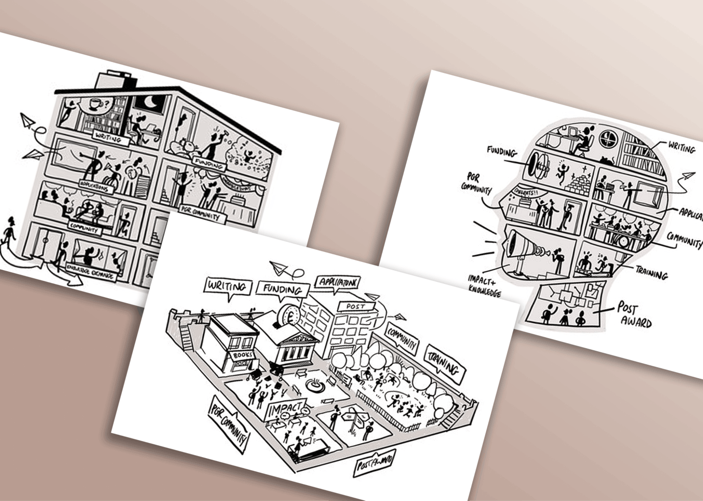
We then designed an interactive infographic using a visual metaphor that mirrors the researcher development journey and is distinctly visually York (including Long Boi the swan!). Rather than asking researchers to read through lists and links, the tool lets them see the full picture at a glance and click through to the specific support they need in an engaging way.
The tool was embedded directly into the department’s website, replacing the previous multi-page approach with a single-entry point. Every researcher’s first encounter with support services is now visual, navigable, and quick.
The department now has a support system that researchers use, rather than one that technically exists but goes undiscovered.
If your institution offers extensive support but uptake is low, the issue is discoverability, not demand. Researchers won’t use what they can’t find, and they won’t search through pages of text to find it. The solution isn’t more information — it’s better structure and a faster, engaging path to the right resource.
We turn complex services or pathways into clear, intuitive, visual tools people can use with ease.