Does this feel familiar?
An email lands in your inbox. "Introducing Our New Transformation Programme."
Your heart sinks. More change?
There was a restructure last year. A new strategy six months ago. A digital transformation programme before that. Now it's culture change. Service redesign. Efficiency savings. New ways of working.
You attend the briefing. You skim the slides. You nod along. But the change doesn't feel like yours, it feels like it's happening around you - so you resist it.
Universities are facing times of unprecedented change. Navigating it well is the difference between a transformational culture and an underperforming one.
Change is often done badly. Enforced on people, rather than created with them. Poorly communicated. Impossible to implement as it’s just not clear.
So how do we do it well?
How do we co-create change together so it unites and engages teams, not drives them apart.
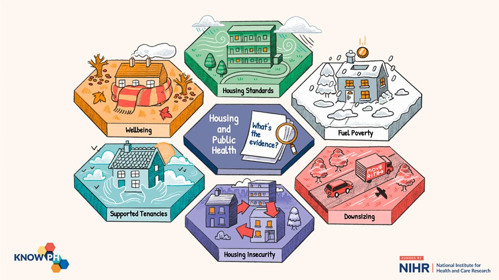
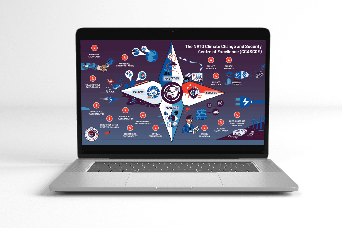
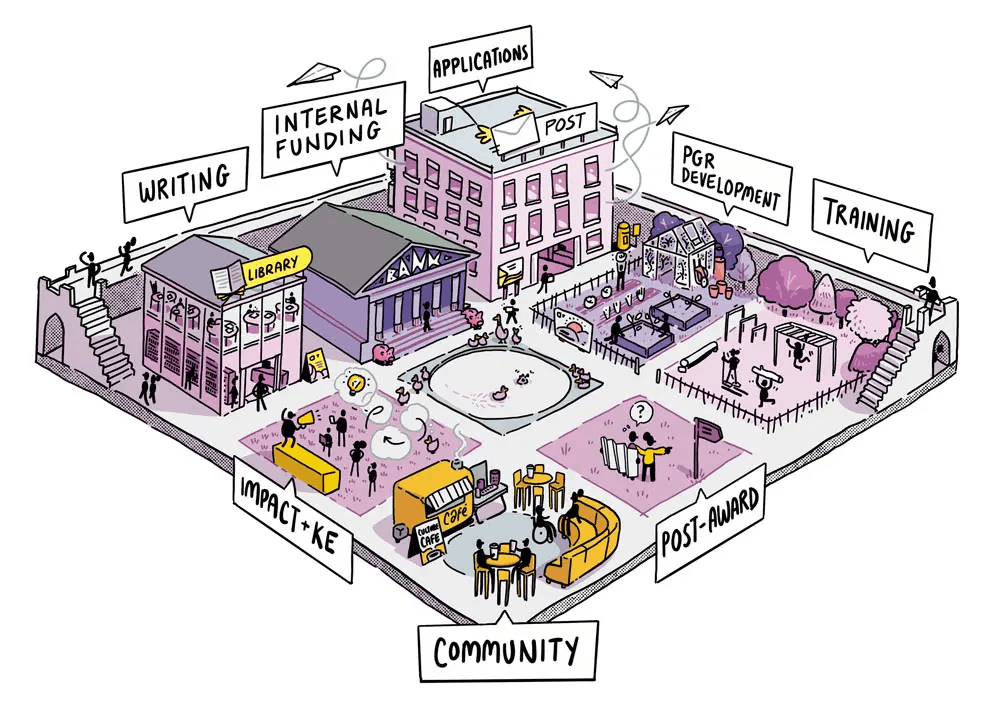
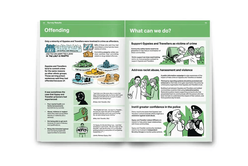
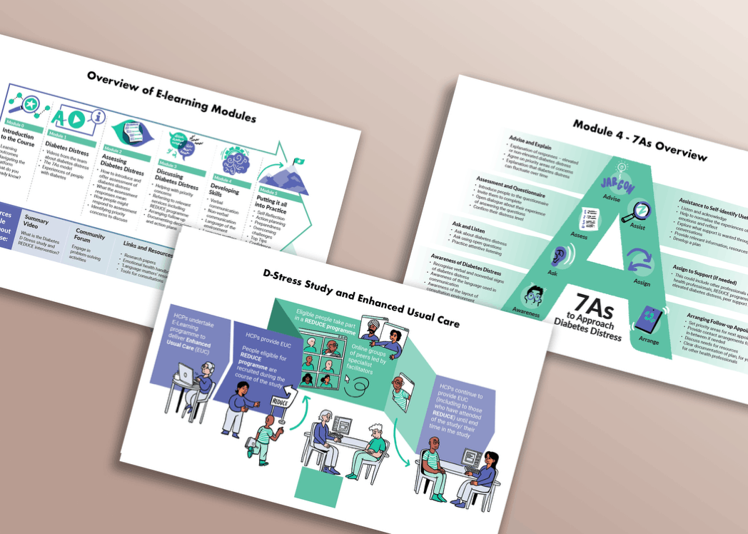
We’ve worked with over 80+ universities internationally and 100+ public sector organisations worldwide to help them navigate change successfully.
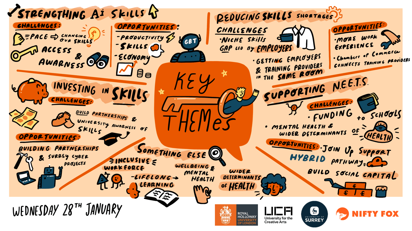
Using our ‘drawing together’ method, we’ve shaped and embedded:
-
UK-wide government test and learn strategies for research
-
University change management strategies in the US and UK
-
Climate security strategies for NATO
So here’s how to make change understandable and actionable through visual storytelling.
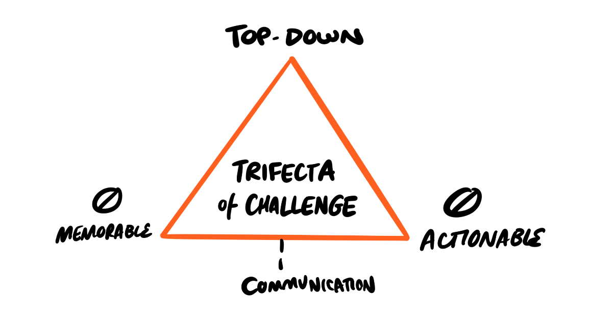
1. Understand the ‘change trifecta’ - why change doesn’t stick
-
Change is enforced from the top down – so operational teams don’t own it
-
Change messages are often too long, not consistent, and reliant on endless - and sometimes conflicting - words. So the change message isn’t consistent, clear or usable.
-
Because change isn’t co-created or communicated well, it’s then impossible to action.
Change isn’t what leaders say. It’s what teams understand and do.
If that message is misunderstood, change stalls.
2. Unclear communication is the root of all change problems
EVERYONE will go through the Kubler-Ross change curve.
Shock > Denial > Anger & blame > Bargaining > Depression > Acceptance > Problem solving.
This will ALWAYS HAPPEN. You can’t bypass it.
But what do most organisations do?
Slow down the progression through the curve by confusing communication for drowning people in death by PowerPoint.
Endless words don’t create more clarity.
Making change visible, understandable and actionable do.
Leaders must understand that WORDY POWERPOINT IS NOT A CHANGE MANAGEMENT TOOL!
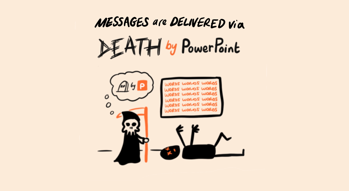
Death by PowerPoint is a scientifically proven thing
-
Word-stuffed slides and a person speaking at the same time leads to cognitive overload of our audience, which means that (Hoffield, 2023)...
-
Our audiences have poor comprehension of what is being delivered and (USW, 1999)…
-
In lay terms, make our audience more stupid at the end of the presentation! MIT (2019) conducted an experiment where a control group received a traditional PowerPoint presentation. An experimental group had the same information delivered via just a person speaking about the topic. Both groups were tested on cognitive ability pre-session and post-session. Those in the control group performed worse on their cognitive ability scores afterwards.
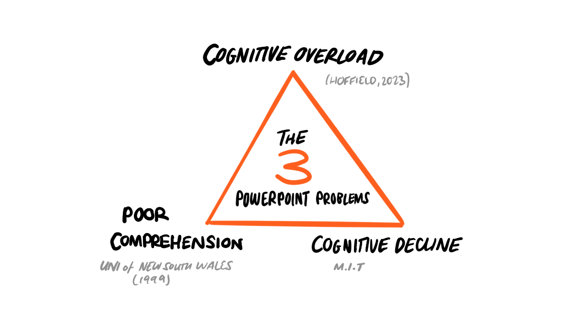
The medium really is the message - and leadership is getting it wrong.
3. Successful change relies on 3 core ingredients.
Successful change needs three things:
Co-creation - change designed with people, not for them.
Change cues - visual anchors that make change memorable and actionable.
Consistent communication - reinforcing the story long after the initial change meeting ends, through your repeatable ‘change cue’.
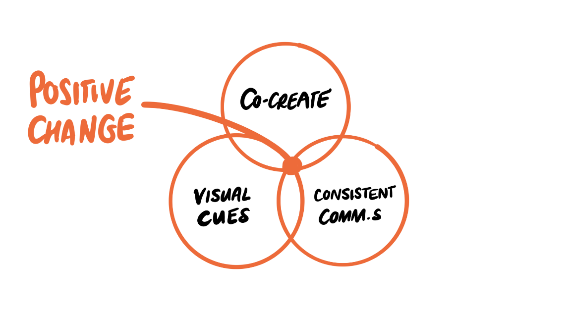
These three ingredients ensure change is embodied in everything teams do - that can only happen through recognition and repetition.
Sounds great, but HOW do you ACTUALLY do that?
4. Co-create change by physically drawing together
At this point, some people hear the word "drawing" and immediately switch off.
Stay with me. This isn't about creating artwork. It's about creating shared meaning.
One of the most powerful concepts we've adopted comes from the practice of generative scribing: communal sense-making through pictures (Bird, 2018).
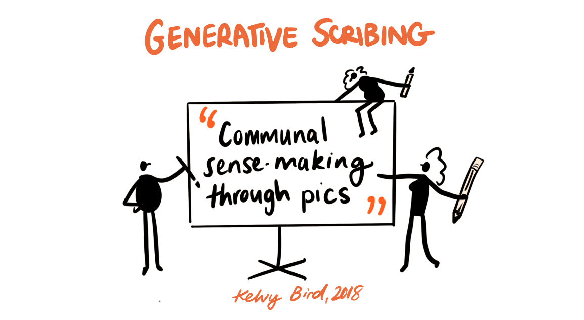
Put simply, it helps groups think together.
When ideas remain verbal, they often belong to the loudest person in the room. When ideas become visible, they become collective.
People can challenge them. Improve them. Build on them. Connect them.
The conversation stops being about personalities and starts being about possibilities.
That's particularly valuable in large public-sector organisations where change often involves multiple teams, professions, departments, and stakeholders.
Visual thinking creates a shared space where everyone can contribute to shaping the future.
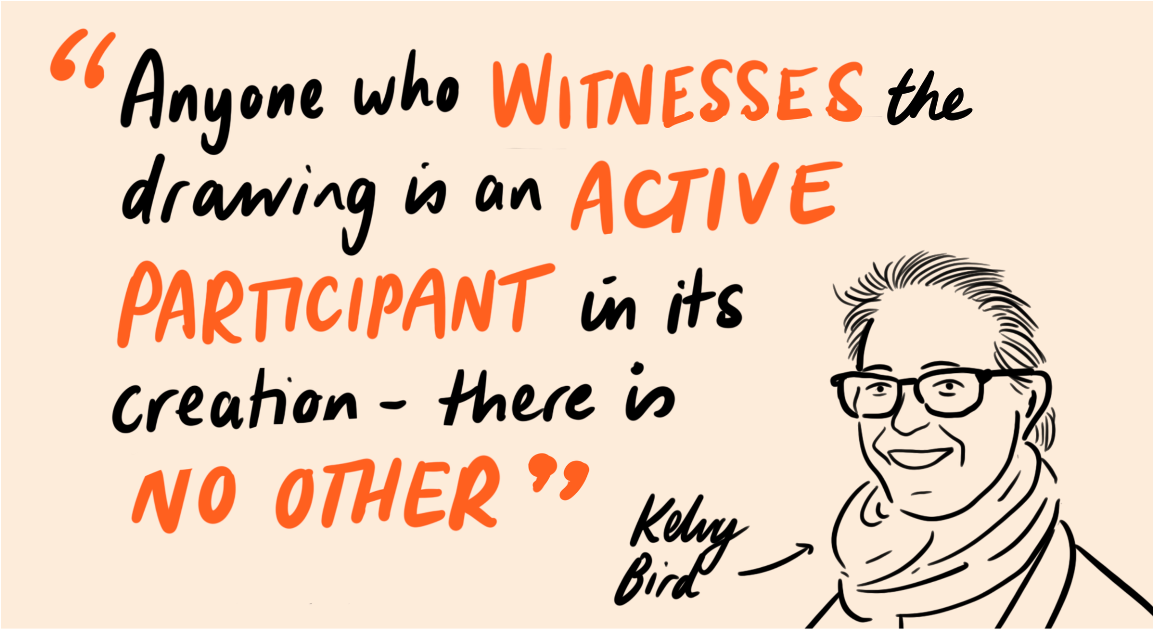
It’s not just about drawing ANYTHING, it’s about drawing with PURPOSE to generate new meaning.
There are 4 levels of drawing:
1) to mirror what’s being said verbatim – you say ball, so I draw a ball
2) to interpret what is being said – you talk about a ball, and I put that ball in context I.e. someone kicking it
3) to connect ideas together – you talk about playing football, so I draw what that means in a game (did you win and score or not)
4) to surface new meaning – you talk about football, and together we find new ways that football can be played
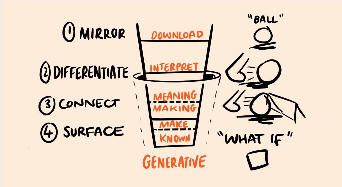
This surfacing is intrinsic to generative scribing – by drawing together, we can draw change and new realities that weren’t there before.
The act of drawing it and not speaking it, makes it tangible, visible, and easy for all to see, critique and adapt without it being personal to the speaker.
5. Use the Bridge of Possibility framework to co-create change with teams
The best visual framework to co-create change as a team is the ‘Bridge of Possibility’ that we’ve developed at Nifty Fox. Use this at team meetings before change begins, to co-create what the future looks like.
It’s based on ‘backcasting’ theory – defining a desirable future goal and working backward to the present, rather than looking at current trends to predict what will happen next.
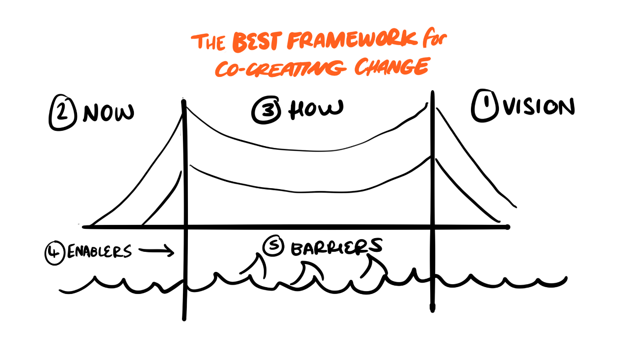
1) You start with the far side of the bridge and define your vision – drawing and writing what that looks like on post its.
2) Then the near side of the bridge to determine your current reality – drawing and writing what that looks like on post its.
3) Then the connecting road between those two points – HOW will you get there? Thinking about the short, medium and long term actions needed.
4) Then the supporting structures (enablers) and sharks (barriers) that might help or hinder on the way.
By the end of the session, you’ll have your very own ‘change cue’ - a co-produced, memorable, and actionable metaphor to consistently communicate your change message.
The future of change isn't words.
It’s co-created, clear, and actionable visuals.
The organisations that will navigate the next decade of transformation successfully won't be the ones producing the longest strategies or the most polished PowerPoint decks.
They'll be the ones that help people see themselves in the future they're trying to create.
People cannot act on a future they cannot see.
And they won't believe in a future they didn't help create.
Drawing together helps teams build futures - so they own, visualise, and action the change.
Need help with this? Get in touch at niftyfoxcreative.com.
View All Blogs